All-New Barney Ebook Branding
Added at 09:42 on 04 March 2021
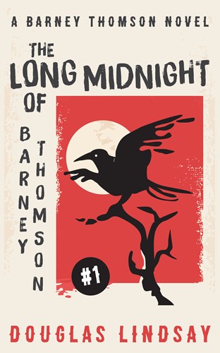
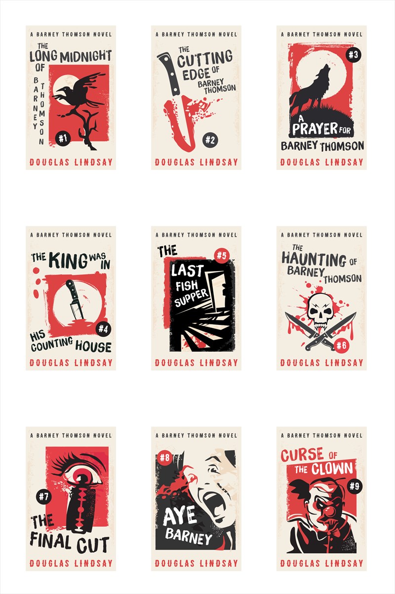
The branding of the Barney Thomson ebook series has been given its eight millionth reboot. That’s the news.
It’s been a struggle finding the right covers for Barney. The series is, by turn, dark and comic and stupid and melancholic and grotesque and absurd and sad and silly and burlesque and strange. Hard to get that in a series of covers. In all the years and variations that the team here at Long Midnight Publishing (there is no team) have published it, we’ve never managed to get the feel right. I don’t think anyone else who’s published them has either.
The Freight Books cover, which was basically the movie poster, obviously worked. Except, that it made it look like it was the book of the film, which it wasn’t. It was just the same old book, which is quite different in feel to the movie. Really, changing the title and putting Mr Carlyle on the front, was disingenuous. So, actually, also a poor cover.
This is the latest attempt. I think they’re the closest yet to the right tone. Not perfect, but decent. Solid. Like the Rangers defence this season. (Apart from the games against Benfica and Antwerp.)
My dream – and I realise this isn’t great marketing, where I give the new thing and say, actually I’d prefer to do this – but my dream is to have old-fashioned pulp covers. I think Barney is spoofy enough to pull them off. Hard Case Crime is still using those kinds of covers, and they are indescribably cool. I wonder if all crime writers wish they could have those kinds of covers. However, while they were obviously used in the old days because they were cheap to do, they will now be super expensive. And there are nine novels in the series, plus the novellas and Scenes From The Barbershop Floor. That’s a lot of bespoke artwork.
One day. But not today. Today we have these, with which the team here at LMP (there is no team) are more than happy.